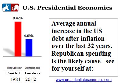
Compare how the economy fared under different Presidents
- Compare how the economy has performed based on up to 9 indicators by selecting the indicators below and a beginning and ending year.
- To compare a single economic indicator across Presidents over time, use the Data by President page.
- The annual change in the economic indicator is graphed.
- See the Methodology page for a description of the economic indicators and links to the actual data.
Change the last year from 2012 to 2008 in the graph below to see how much the Great Recession has affected the US economy. Click on the graph to update the numbers.
Tips to use this chart
- Asterisks indicate the better rate of change. For instance, the higher GDP rate and the lower unemployment rate will have an asterisk.
- Red refers to the Republican party and blue refers to the Democratic party.
- Presidencies begin in odd number years the year after the election, so the Obama Presidency begins in 2009 even though he was elected in 2008.
- Presidencies end in an even year divisible by 4.
- But – any years can be selected. Compare 2008 with 2009 for example by selecting those 2 years.
- Uncheck the box to ignore inflation; otherwise, real inflation-adjusted figures are graphed.
- Generally, the annual change in the indicator is presented, such as the annual change in the Gross Domestic Product (GDP). However, for unemployment, inflation, and interest rates, the 12-month average rate is presented.
- Higher numbers are better for GDP, stock and bond returns, and personal disposable income.
- But, lower numbers are better for the remaining categories, which are generally concerned with spending and debt, or indicators like unemployment, inflation, and interest rates.
